Top Selling
Software Categories


Top Trending Products

 4.6
4.6 


Best Seller

₹400
/User/Month

Best Seller

₹8,200

Sponsored

Price On Request

Best Seller

₹15,400


.jpg)


Trending Product Comparison


.jpg)
Popular Comparison by Category


.png)


- Cyber Security
- Infrastructure
- Cloud Services
- Network
Introducing Techjockey Enterprise
Streamlining Tech Discovery & Procurement
for Scalable IT needs
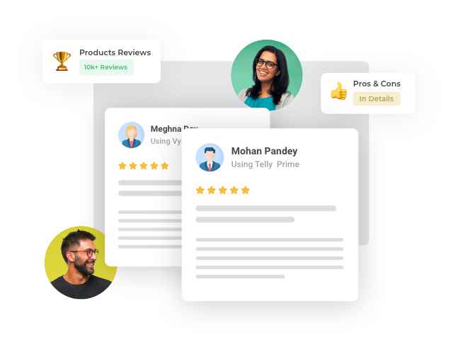
We’d love to hear your feedback!
Review your software
Tell us about experience, pros and cons of your using product.
Top Selling Products
Best Seller
₹400
/User/Month
Best Seller
₹8,200
Sponsored
Price On Request


Our Expert Publications


")
Free And Open Source,Utility Software And Tools
April 24, 2024


“Techjockey helped our company match up with the best software to fulfill our needs. The support team at Techjockey sure know what they are doing and they know the right answers. Thank you so much for all you have done to help our business head in the right direction. Keep up the great work!!”
Sonal Agarwal
Milkbar Bakery

“With so many options on their website, the selection process became really quick. The deployed E-way bill generation for imports is helping our business make a giant leap in terms of sales and profit. After receiving their commendable service, there is no doubt that they put the customer first.”
Richa Maheswari
Chartered Accountant

“The Microsoft CSP renewal process was much quicker and easier, thanks to Techjockey. They offered us the best plan as per our expanding business requirement. Glad that we made the right choice of going with Techjockey. ”
Iftekhar Khan
Woo App
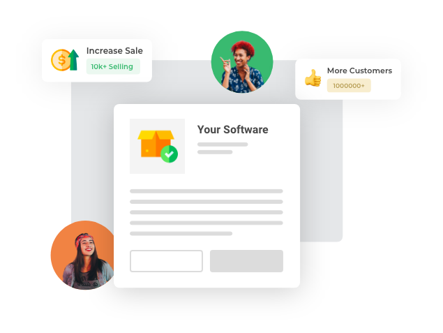
Grow your business faster
by selling your software
Sell your products to crores of customers on techjockey.com
Customer Success Stories


Accounting, Case Study
June 13, 2023


News Coverage


Buy Software Online In A Few Simple Steps At Techjockey
Are you planning to buy software online? Techjockey is your go-to platform for purchasing the right software from trusted sellers. With 15k plus software listed on the website across specific business categories, you will most likely get what you want. Verified software reviews and competitive software prices with discounts and offers make software purchases online quite easy, even for small businesses and startups.
You can also purchase hardware online with business software at the best price. 20 Lac plus happy customers trust Techjockey for all their software and hardware needs.
Get The Best Computer Software Online For Automation & Growth
From accounting software to HRMS, CRM software, billing & invoicing, and ERP, the platform offers multiple options to buy computer software online and streamline your business processes. Now, you can move over from manual processes to automated functionalities and witness an exponential increase in productivity.
You will also find industry-specific IT solutions at this B2B software marketplace, such as jewellery software, fashion design software, stock market software, legal case management software, etc.
Furthermore, there are software for individual users like graphic design software, photo and video editing software, SEO audit tools, plagiarism checker, social media management software, and so on.
Why Choose Techjockey For Your Software Purchase Online?
Techjockey is considered one of the best websites to buy software online because of the trust factor involved. You get software reviews from real users. This will help you understand the experience of your industry peers with any software. Also, you can book a free software demo to go through the functionalities and decide to buy the right software. Moreover, the platform also verifies the sellers on different parameters like reviews & ratings, prompt response to customer queries, ease of implementation, etc.
Software Buying Made Easy With Verified Software Reviews & Quick Software Comparision
Techjockey is not just a platform to buy software online at the best prices but also offers authentic reviews from certified users. Reviews have become critical for anyone to make the right buying decision for any product. And the same logic applies to software and hardware buying also.
This platform is committed to making software buying easier than ever by providing product reviews from real users and industry experts. These reviews are often based on user experience, value for money, pros & cons, customer service, etc.
Considering several software providers' websites to compare features, pricing, deployment, etc., is time-consuming and ineffective. Moreover, the official website's reviews tend to be biased and don't provide a balanced perspective.
Techjockey makes software comparison a deciding factor in the buying process by allowing buyers to compare up to four products side-by-side.
Get The Best Software Price Without Compromising On Features
You will find thousands of SaaS solutions on this online marketplace, with diverse pricing options – Monthly, quarterly, and annual. You can subscribe to any software on the cloud and get the best functionalities without surpassing your budget.
Wait...are you looking for a lifetime deal? You will also get that here. Many system-based software solutions are available at an upfront cost. So, you need to understand your business needs and choose the best option between cloud-based and on-premises software. The software price list and product variations at techjockey.com will never disappoint you!
However, you need to check for the annual maintenance cost, customization cost, and other pricing factors to get the best computer software price.
Still, Thinking About Whether To Buy Business Software Online Or From Stores?
Buying software online is not a problem if you understand your business needs. After all, there is every possible functionality to assist you – reviews, demos, software comparisons, alternatives, smooth checkout, and many more- to simplify software buying.
There is something for everyone!
See more

How to Buy Software on Techjockey?
You can choose from 15k plus software for your business by comparing their features, pricing, and more. Free software demo and expert consultation further assist buyers in making an informed purchase.
Is Techjockey legit?
Techjockey is a trusted eCommerce platform that allows you to buy IT solutions with 100% secure payment. Authentic user reviews for every software helps customers make the right choice.
How to List Your Product on Techjockey?
Visit Techjockey.com and Click on ‘List Your Product’ on the top. Then, you simply have to sign up at Techjockey eSeller Hub and start adding your product details. Our sales experts are there to assist you.
![]() 20,000+ Software Listed
20,000+ Software Listed
![]() Best
Price Guaranteed
Best
Price Guaranteed
![]() Free Expert
Consultation
Free Expert
Consultation
![]() 2M+
Happy Customers
2M+
Happy Customers